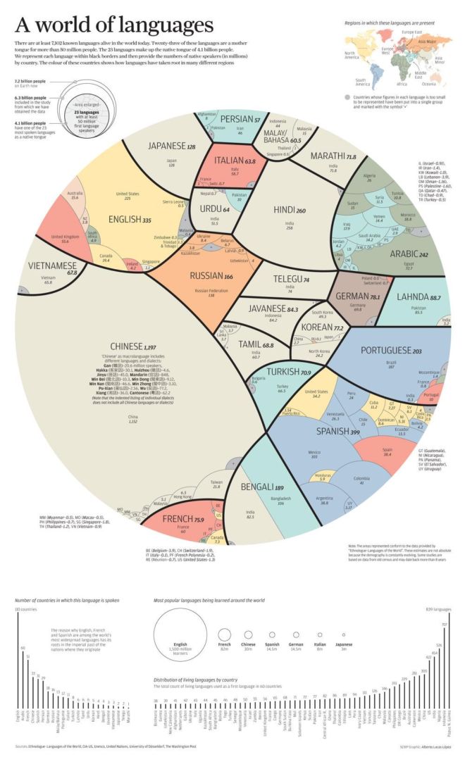
This fascinating infographic elegantly breaks down the world’s most popular languages and the countries in which they are spoken. Specifically, the circle represents the 4.1 billion people around the world who speak one of 23 of the world’s most-spoken languages as their native tongue – the numbers of people speaking an actual language in any given country may actually be higher. It was created for the South China Morning Post by Alberto Lucas Lopez, an infographic journalist.
InfographicSpoken Language

