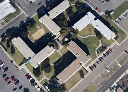
2013 picture of buildings
The Naval Amphibious base compound in Coronado, CA was built in the 1960s to house young sailors. It consists of 4 L-shaped buildings centered around a hub. Cut to 2007, where a diligent Google Earth surfer ?discovered? that the building’s configuration resembled a giant Nazi Swastika. The architect John Mock defended his design, saying the Swastika wasn’t intentional and that the building even won an award. Because of the uproar, however, the Navy apologized and said they would spend up to $600,000 on ?landscaping and architectural modifications?. But, a recent visit to the site in Google Earth reveals the design is still there, lending credence to a conspiracy theory that it was indeed purposeful. Other ?evidence? is detailed in an article in the Daily Kos, which points out that any building would not only have above-view blueprints, but also a miniature model made. Any person, especially one in the US military would notice the Swastika resemblance immediately. Another fun fact: the buildings are built at the intersection of Tulagi and Bougainville, two streets named after World War II battles. Innocent mistake, or deep conspiracy? Tell us what you think in the comments!

Vintage postcard of the original design
It seemed like an elegant and unique idea at the time. The Standard Oil Building in downtown Chicago was briefly its tallest building when it was completed in 1974 (the Sears Tower took the mantel the following year). The architects decided it would be a great idea to cover the building in Italian Carrara Marble. But the marble proved to be too fragile – during construction on December 25 1973, a slab fell off and landed on a nearby building. Later, in 1985, cracks and bowing were discovered on many of the marble slabs. In 1990, the marble was replaced for an estimated $80 million dollars. (The building is now known as the Aon Center.)

The Vdara Hotel in Las Vegas is a hotspot… literally. The glass crescent-shaped building with a pool is fairly unremarkable by Vegas standards. But combined with the glaring hot sun and lack of other obstructions, the curvature turned out to serve as a giant magnifying glass of sorts, creating what MGM Resorts (the building’s owners) like to call a ?solar convergence? but employees have nicknamed the ?death ray?. The building made news when a visitor complained he had been burned, his hair singed, and his plastic bag melted from this ?ray?. A similar problem occurred when Frank Geary’s Disney Hall opened in Downtown Los Angeles; its swirling metallic frame was eventually sandblasted to deal with the intense glare that local residents complained was heating up their condos by 15 degrees. (As of now, no word about a fix for the Vdara – maybe it’s a tourist attraction.)
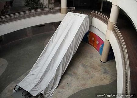
It was supposed to be a shopper’s paradise, but instead it’s a dead zone. Noodle billionaire Alex Hu Guirong had a vision of creating a mall to rival The Mall of America in his home town of Dongguan, China: he called it the South China Mall. As far as size and scope, it is impressive: 7 million square feet (more than twice that of the MOA) and buildings designed after famous landmarks in Venice, Paris, Rome, and Egypt. But they forgot to consider an important factor: namely, location, location, location. It is not near any major transit hub or airport – one reporter said it took 2 1/2 hours to get there from just 6 miles away. Add to that, the city itself is home to low-wage-earning factory workers who don’t have extra money for fancy shops. Speaking of fancy shops, that’s the third problem: there are none. In spite of adding a ?New? to the name in a failed relaunch in 2007 (it opened in 2005) the New South China Mall is still 97 vacant in 2013.
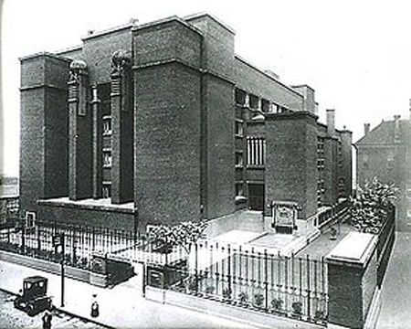
Frank Lloyd Wright is one of the most famous names in architecture, but he’s also famous for his shoddy work (as well as being a huge jerk). He may have built many iconic buildings including Fallingwater in 1935, considered one of America’s best, but many of his buildings are plagued with design flaws. One of the most notorious was the Larkin Administration Building, designed and built for the Larkin Soap company in Buffalo, NY in 1906. The building itself was innovative in a lot of ways, using natural sunlight, its own ?air conditioning?, and included the first hanging bathroom stalls. But, like many of Wright’s structures, form took precedent over function. All of its interior light came from the skylight 76-feet above the main floor, which was supposed to be a communal working area, with tiny offices pushed off to the side. There were reports of leaky roofs, dark workspaces, and lack of privacy. Many praised the design, but some felt it was monstrous and bleak, especially from the outside. Hard times fell on the company during the Great Depression, and eventually folded in 1945. Because of its unusual design and high upkeep costs, it sat vacant for 5 years, with nobody ponying up to foot the bill. Finally, in 1950 it was ordered demolished by the City, a process which took 2 years because of its density. Some consider the destruction of the building to be ?blunder? as to its historical significance, others say the building should have never constructed in such a extravagant fashion. Either way, it is a huge fail.
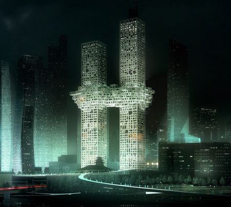
This reminds me of something…
Was it an inadvertent blunder, or an insensitive gesture? Regardless, the design of this South Korean building caught international flak when its design was revealed in 2011. According to the building’s Dutch architects, the area is supposed to represent a ?pixelated cloud? which would have a wellness center, swimming pool, and cafe. But to many people, especially those in the US, the building’s structure reminded them of the exploding Twin Towers of September 11. The architects issued an apology and there was rumor of a redesign, but as of now there is no official word.
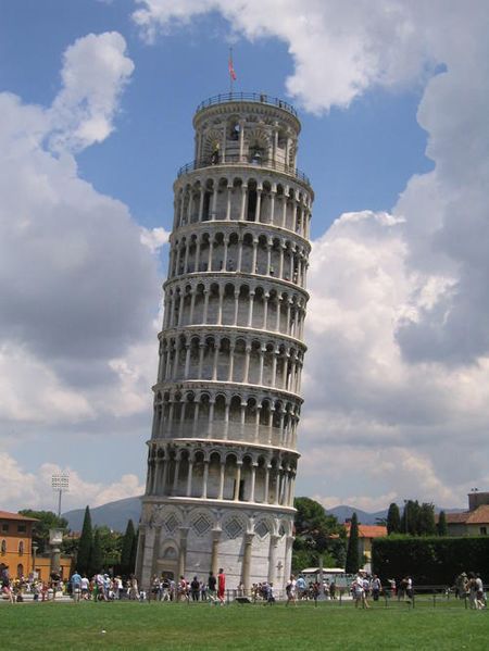
We conclude this list with a nod to the Leaning Tower of Pisa, a failure that turned out to also make it famous. Construction of the Tower began on August 9, 1173, led by architect Bonnano Pisano started off smoothly. But a few years later, when building the third tier, the tower began to tilt, due to its clay foundation. Construction was stopped off and on for literally hundreds of years. But something must have intrigued the Pisans, for they continued to build in spite of the flaw. It was finally completed in 199 years later in 1372 by a relative of Pisano. Surviving wars and gently defying gravity, the Tower still stands – or leans – as a beautiful testament to human ingenuity in spite of setbacks.

