When it comes to interior decoration, the devil is in the details, and a small mistake like a rug that’s too small or curtains that are too short can really throw the entire room off balance, making it not only look a bit uninviting but also feel uncomfortable. Fortunately, the majority of these small mistakes are preventable and easy to fix, you just have to know what to keep an eye out for. Here is where we can help, teaching you about 10 very common interior decorating mistakes.
1. Incorporating Dark Colored Furniture in Small Spaces
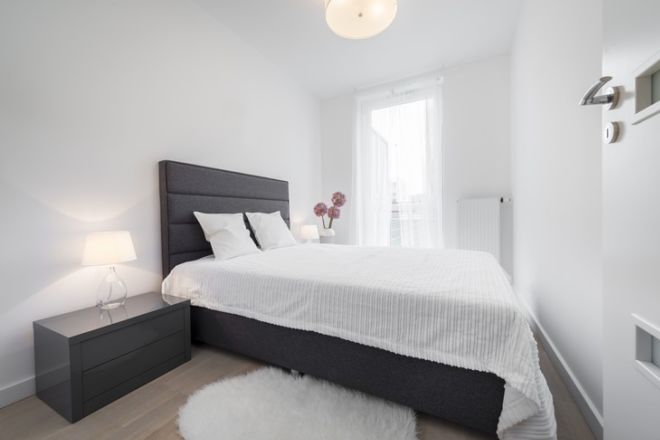
When it comes to smaller living spaces, such as apartments, narrow rooms, or corridors, one of the biggest mistakes people make is incorporating dark and bulky furniture. While dark brown, grey and black pieces may sound like a safe choice, it can really emphasize how small or narrow a room is.
The goal in these kinds of rooms is to lift and trick the appearance of a broader space, and the best way of doing so is by using lighter colors, or even transparent or reflective pieces, as well as lightweight and fluffy fabrics.
2. Not Considering Scale and Proportion
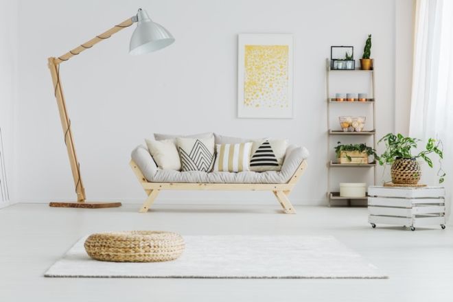
Do you just wish that the oversized lamp on the left was half its size? This isn’t surprising, as this huge lamp, though an interesting piece in itself, doesn’t fit the other items in this room in terms of size at all. A lone bulky item like this in one room makes the entire room look stuffed and small, it literally dwarfs its surroundings.
To remedy this mistake, it would be wise to add at least one more large item in this room, such as a larger sofa, for example. Remember that the secret to proper scale and proportion is mixing a variety of different sizes, heights, and shapes.
3. Unique and Bright Colored Furniture Can Be Difficult to Repair or Replace
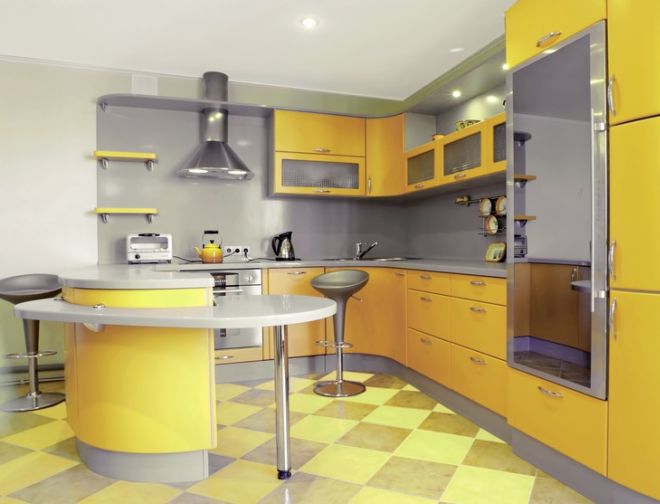
When it comes to interior elements that are difficult to replace, such as tile, countertops, doors, built-in furniture, and cabinets, it’s always advisable to opt for universal colors, textures, and finishes. This is because finding a suitable replacement when fixing these pieces always proves difficult, as these trendy items come and go off store shelves.
Apart from that, it might be a good idea to stick to pieces with simple shapes and plain colors because you might get tired of the more bright-colored and unique items quite quickly. This kitchen, for example, while quite cheerful looking, will surely fall out of fashion in less than a few years, and is bound to turn into an eyesore.
Don’t get us wrong, incorporating trendy statement pieces is an excellent way to spruce up a room’s interior, but it’s best to do so with items that are easy to switch up when you get tired of them.
4. Overcrowding Storage Spaces
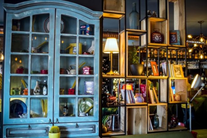
If the room in the picture above looks crowded and cluttered to you, you’re not alone. The problem with this shelf arrangement is the oversaturation of space with small objects or varying colors, and we see this mistake everywhere, not only on bookshelves or cupboards.
To avoid this mistake, simply cutting down on the number of items won’t cut it, as you have to also make sure to switch up the sizes and shapes of objects. If you have a collection of accessories you love, another hack you can do that will trick the eye into believing you have less stuff is grouping the items together according to color or size in groups of three instead of just showcasing them one next to each other. Try it, it really works!
5. Hanging Paintings and Shelves Too High
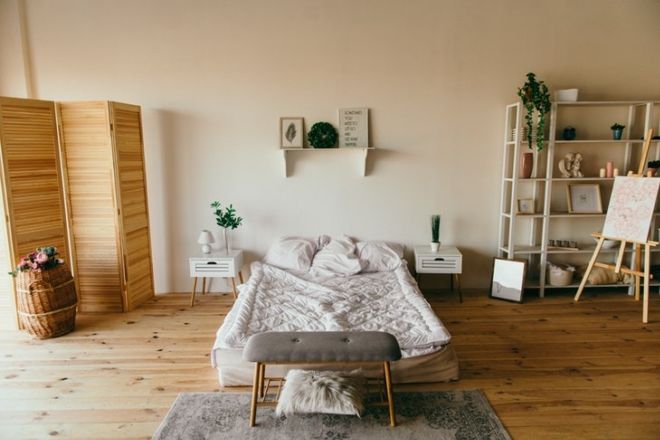
One way to make the room really awkward is to hang shelves and especially art too high. This is especially true in situations where there is only one shelf or artwork that acts as the centerpiece of a room, as is customary for bedrooms. In the example above, for example, the shelf right above the bed is hung a bit too high, which makes the bed and nightstands shrink in size and the wall appear way too bare.
In most cases, you should hang artworks and isolated shelves at about eye level, or about 145-150 cm (57-60 in) above the floor level.


